A marquee partner was looking to upgrade their user portal with a FICO Score Planner—and was considering leaving their current provider to do so. We didn't have one, but if we could build it in time, we'd win the bid. I had two months, a black-box API I couldn't modify, and a legacy platform with real constraints, but also an opportunity created by competitors' confusing, imperfect solutions.
With three targeted design decisions (the right interaction pattern, adding visual engagement to an otherwise static feature, and dynamic content), I delivered a credit goal tool that was more straightforward and useful than our competitors’. We closed the deal, and the feature now serves 19,000 users daily, with a 20% plan completion rate and an average credit score increase of 33 points.

From competitive gap to competitive edge
Experian Partner Solutions provides a platform of financial wellness and identity protection tools that partners brand and offer directly to their users. A Score Planner is one of those tools — it lets users set a target credit score and track their progress toward it, turning an abstract number into an actionable goal. The gap was two-layered: the competitor had a Score Planner, but only a VantageScore one. The partner wanted FICO — and we didn't have a Score Planner at all.
I led the end-to-end design of the feature. I shaped the project timeline, defined the user flows, designed the interface, wrote the content and interaction logic, and owned the handoff to development. I collaborated with a Senior Researcher who conducted usability testing, alongside a Product Owner and the development team.

Competitor 1
The red target is draggable, but there is no indication of the restrictions: the target score must be at least 10 points higher than the user's current score, and not all timeframes are available for every target score.
Competitor 2
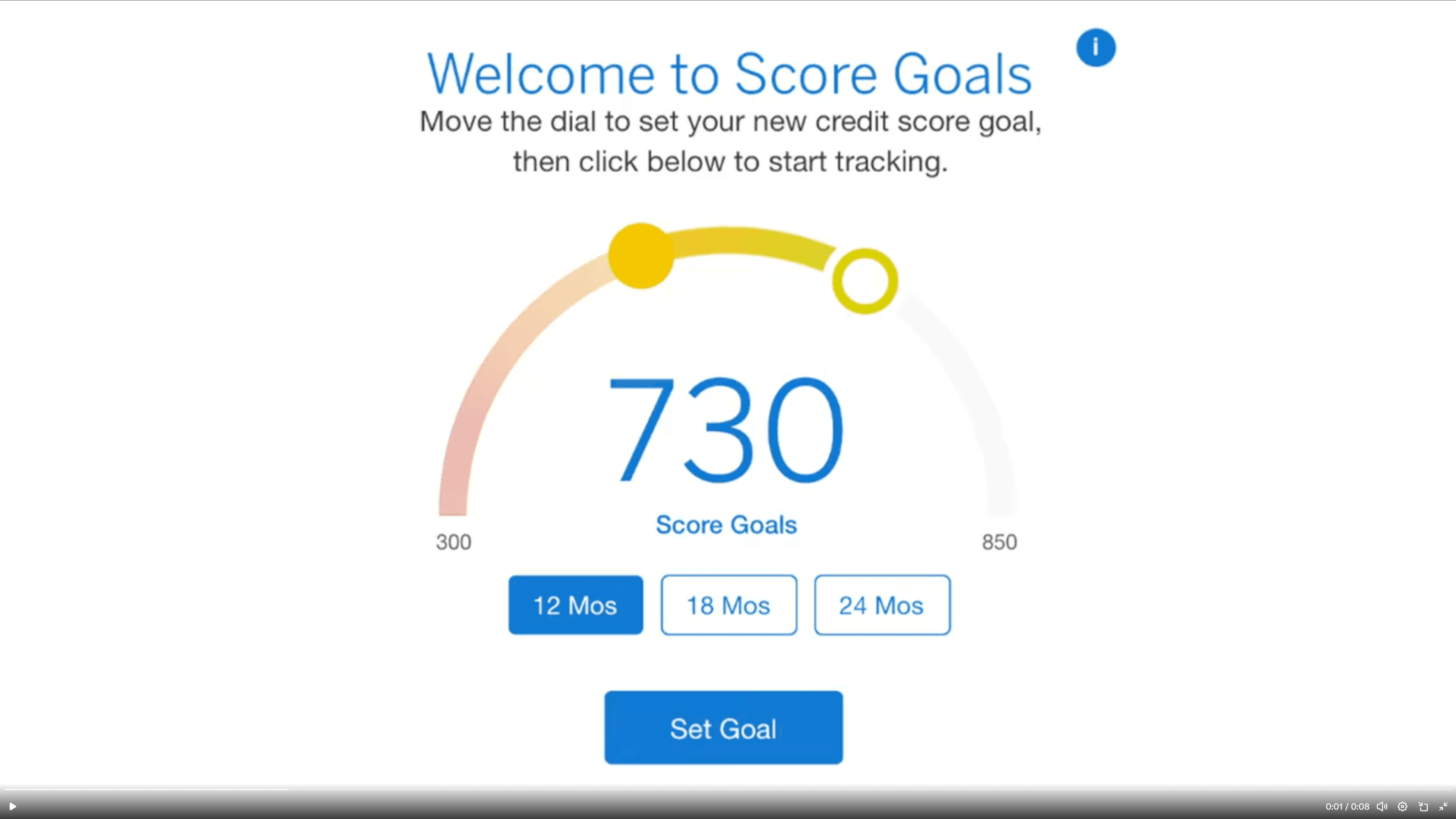
The user selects a timeframe, then uses the slider arc to set the score goal, and clicks to set it. Once a goal is set, the steps needed to achieve it are revealed.
THE CHALLENGE
Designing for the full spectrum
Although the partner opportunity prompted us to build this feature, any tool we create eventually becomes available across all of EPS's partners — meaning we were designing for a vast, diverse user base. Having designed numerous credit products at EPS, I understood the space well: credit management is genuinely consequential, and the people using this tool would range from financially comfortable users optimizing their score to people in real financial difficulty seeking a foothold. The solution needed to work for all of them.
“
So, for just improving my score as a target goal, this would be really helpful.
–Participant 1, Kansas
”
The constraints were clear from the start. The underlying API was a black box we couldn't modify; we were building on a legacy platform, and every competitor I audited had addressed the same design challenge with novel visual interfaces that largely caused confusion. The opportunity wasn't to be more creative than our competitors. It was to be clearer.
My role
I led the design of FICO Score Planner from start to finish over two months. I shaped the project timeline, defined the user flows, designed the interface, wrote the content and interaction logic, and owned the handoff to development.
I collaborated with a Senior Researcher who conducted usability testing, a Product Owner who managed the business requirements, and the development team who built and shipped the feature.
FRAMING THE PROBLEM
Three problems, one principle
The competitive audit and platform constraints surfaced three design problems. Each had a different solution, but all three were guided by the same principle established in the audit: clarity over novelty.
Problem
Approach
Success metrics
Pattern
The standard modal pattern left the initial state nearly empty and buried the relationship between the two inputs
A/B test modal vs. progressive disclosure with five participants
Task completion speed
Participant preference
Visual Interest
The feature had no inherent visual engagement; competitors had tried to solve this with novel interfaces
Enhance the existing score chart with a goal line; resolve design debt in the same update
Visual clarity
Design debt addressed
Dynamic content
After goal-setting, the API returned nothing, leaving the feature static for up to a year.
Write progress-based headlines; work with dev to surface the right message based on score progress.
Users have a reason to return
Feature feels alive over time
the design
Choose the right pattern.
The modal was overkill
EPS features typically use a modal form for data input, keeping the main interface clean by moving inputs to an overlay. But Score Planner’s content didn’t fit this paradigm easily. It was only a 2-step flow, but the second step involved choosing one plan from up to 4 options, each with a lot of content. To fit the content in the modal, we would need to either split it across two screens (a wizard) or enable scrolling. The wizard would also require additional logic or UI to allow users to refer back to or change their plan after closing the modal.


Two prototypes, one test
I explored progressive disclosure as an alternative, where the second input would only appear after the first was set. I built clickable prototypes of both approaches and worked with the Senior Researcher to test them with five participants.

Validation
Three of five participants preferred the progressive version, completing the task in an average of 1:35, compared to 2:57 for the modal. Participants favored it because the full flow was visible at once without having to navigate multiple screens. The modal had its advocates, too — two participants appreciated structure — but the advantages of progressive disclosure in terms of speed and clarity were decisive. I chose it as the pattern for Score Planner and added it to the EPS design library, where the implementation team could apply it to other features going forward.

“
I prefer to have the entire overview right there instead of a few different pages.
–Participant 3, California
”
Add visual interest without adding confusion.
Competitors reached for novelty over clarity.
The feature needed visual engagement. Without it, the page would feel sparse and static. But the competitive audit had shown a consistent pattern: designers reaching for novel visual interfaces to solve this problem. Draggable targets, curved sliders. All interesting, none immediately self-evident. The opportunity wasn't to be more creative than our competitors. It was to be clearer.
One update, two problems solved
Rather than invent something new, I looked at what we already had. EPS had an existing pattern for displaying a user's credit score over time as a chart. I added a goal line representing the user's target score, giving the feature a visual anchor. The update also gave the development team an opportunity to fix a known issue with the pattern: the chart's scale had been truncated, losing context at the top and bottom of the range. We addressed both in the same update.
Before

Old: Scale is truncated and context is lost.
After

New: Full scale is revealed and goal line is added.
The decision
The revised chart showed the full score scale with the goal line overlaid, making a user's progress toward their target immediately readable. Design debt was resolved as a side benefit, without requiring a separate project to justify the work.
Make static content dynamic.
The API went silent after setup
Once a user sets their goal, the API has nothing more to offer. No status updates, no encouragement, no feedback on progress. The feature could remain unchanged for up to a year — meaning a user who returned to check on their plan would find exactly what they left. For a tool meant to motivate behavior change over time, that was a significant gap.
The API couldn't help, but the front end could
The API couldn't be modified, but the front end could. I wrote a set of progress-based headlines calibrated to where a user stood relative to their goal — just starting out, making progress, nearly there, achieved. I worked with a developer to implement simple detection logic that identified each user's position and surfaced the appropriate message. The headlines updated as the user's score changed over time.
The decision
A feature that would otherwise have gone dormant after setup now had a reason to draw users back. The logic was lightweight, required no changes to the API, and added a layer of personalization that the vendor's product didn't offer.


Beyond scope
Eliminating a duplicate entry point
While working on the feature, I discovered that an existing alert preference setting already allowed users to set a credit score target — completely separate from the new Score Planner. Left unaddressed, users would have two unconnected places to enter the same information, with no indication that one affected the other.
I worked with a developer to implement detection logic that identified when a user had both active. For those users, the alert-setting input was replaced with a call to action directing them to Score Planner, where they could set and manage their goal in one place. The score set in Score Planner automatically synced to their alert preferences, eliminating the redundancy without removing any functionality.
This wasn't in the original scope. It came from paying attention during implementation and treating a potential source of confusion as a problem worth solving before it reached users.
Before

Existing alert setting resulted in a second unrelated place to enter a credit goal.
After

New variant alert setting removes input and adds a link to the feature page for in put.
Impact
Closing the deal, and then some.
The feature launched with a single partner and quickly validated the business case for building it.
Business
The design helped close the deal with a household-name partner, acquired from a competitor. Experian's marketing materials cite an average credit score increase of 33 points for enrolled users, and 59% of a major bank retailer's customers who enrolled saw their score improve.
Engagement
The partner's platform recorded 120,000 unique logins per day, of which 19,000 were to Score Planner. 39% of users read their planner notifications. Among users who engaged with the tool, 20% saved a plan.
Platform
The progressive disclosure pattern developed for this feature was added to the EPS design library, making it available to other features across the platform. The update to the score chart also resolved a longstanding design debt issue — the truncated scale — that had affected the pattern wherever it appeared, without requiring a dedicated project to justify the fix.
Note: Specific metrics and internal data have been generalized to respect confidentiality agreements.
Conclusions
Takeaways
This project reinforced something I've come to rely on: small projects deserve the same strategic thinking as large ones. The scope was tight, the timeline was short, and the constraints were real — but the decisions made within those boundaries had consequences well beyond the feature itself.
Competitive analysis is a design tool, not just a business one. The audit didn't just confirm that we needed the feature; it also showed us exactly what not to do. Every competitor had reached for visual novelty to solve the same problem and paid for it in user confusion. That finding shaped the entire design philosophy: work with what we have, make it clearer, and resist the temptation to be clever.
Constraints can improve outcomes. The black-box API was the most significant limitation on the project, and it produced the most interesting solution. Because we couldn't modify the vendor's output, we had to solve the dynamic content problem entirely on the front end. The result was simpler, more maintainable, and faster to build than anything that would have required API changes.
Pattern thinking multiplies impact. The progressive disclosure pattern wasn't just a solution for Score Planner — it was an addition to the platform. Designing with reusability in mind meant that one small feature decision created value for every future project that needed it. On a platform serving millions of users across dozens of partners, that kind of thinking compounds.